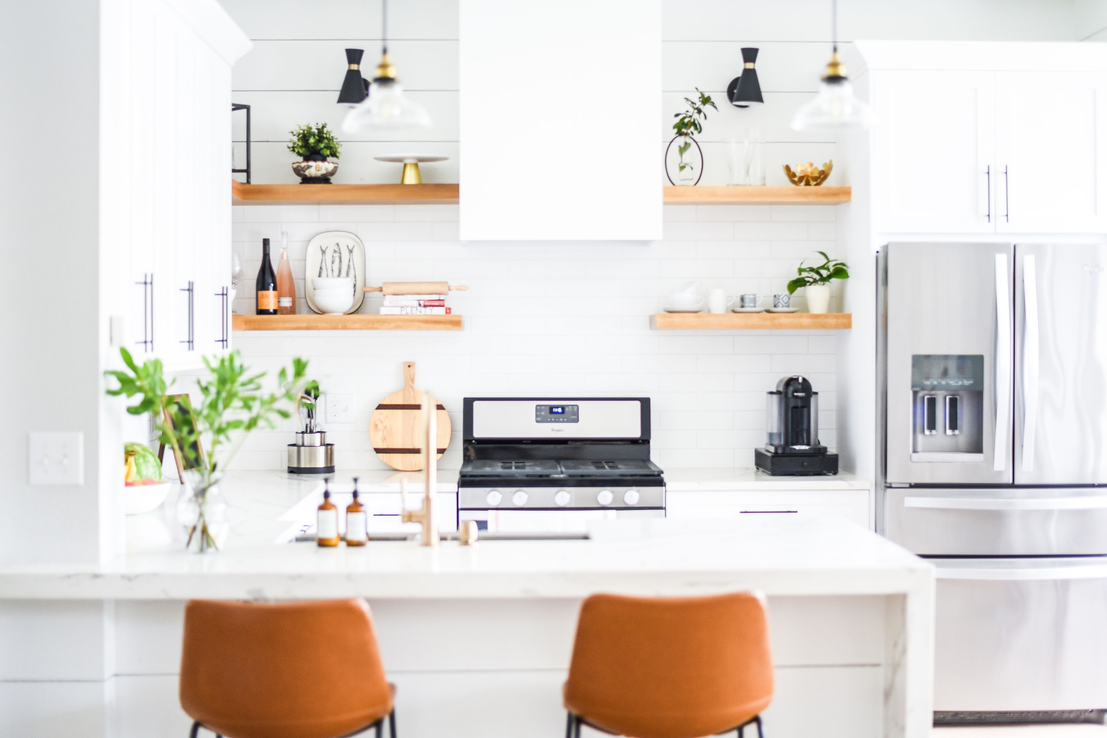
How I Transformed My Not So Desirable Kitchen Into A Beautiful White, Open And Spacious Kitchen.

Guys, we finally renovated our kitchen after contemplating for over 2 years since the day we moved into our 1680 square feet townhouse. After finding out I was pregnant with baby #3, I immediately knew our kitchen had to be gutted and remodeled. Now that I will be nesting with a baby, I knew I needed to love my home. The kitchen was the one room in my house that I did not love, yet spend the most time in it.
If you ever once thought white kitchens are boring, well I hope to change your mind today. In my opinion, white kitchens are classic and timeless. For our kitchen remodel, I wanted to keep it traditional while adding some modern elements and plenty of visual interest to it.
We didn’t touch the layout as this layout functions great for our family but we pretty much replaced everything.
What we did:
- Added taller shaker style cabinets (old cabinets were 30″ in height, new are 42″).
- Added crown molding above the cabinets.
- Replaced the under cabinet microwave hood with a custom built in hood.
- Added open shelves on each side of the hood.
- Lowered the bar top to countertop level.
- Removed the pantry and replaced it with full height cabinets.
- Added deeper cabinets over the refrigerator and panels on each side.
- Replaced the travertine backsplash with white 3″x12″ subway tiles.
- Added shiplap above the shelves and cabinets and on the back of the peninsula.
- Added lighting above the shelves.
- Replaced the tile floors to waterproof/kid proof vinyl wood floors.
- Replaced the speckled corian countertop to the Calcatta gold quartz countertop.
- Added the waterfall effect to the countertop of the peninsula.
- Replaced hardware, faucet and sink.

Despite the layout remaining the exact same, the kitchen now feels a lot more open and spacious. The taller cabinets, the open shelves, the lowering of the bar top, the replacement of the pantry with full height cabinets all played a significant role in this.
The rectangular hood above the range may appear simple but definitely added a modern statement to the overall look and feel of the kitchen. The simple black hardware, stainless steel apron sink, champagne gold faucet and industrial glass pendant lights all added the perfect modern balance to a traditional kitchen.

The shiplap, the crown molding, the beautiful veins on the Quartz countertop and most definitely the waterfall effect adds drama and keeps your eyes captivated despite the very white and neutral color palette.
I absolutely love how our kitchen has turned out and excited to be making many more memories with my family here. I would love to hear what your thoughts are on white kitchens. If you didn’t like them before, was I able to convince you otherwise.


Before Photos (of when we purchased this home):
Related Posts
5 Popular White Paint Colors For Your Home
5 Popular White Paint Colors For Your Home You know I love a neutral…
August 16, 2023How To Create A Multi-Purpose Room with a Daybed
Living in smaller home with our family of five, we had to get creative when…
September 19, 2022


Lisa | 30th May 19
What brand/color white did you use? Your kitchen looks fantastic!
xomyhome | 31st May 19
Thanks Lisa. I used Pure White from Sherwin Williams for all the trim and shiplap in the kitchen.
Eva | 29th Sep 20
Gorgeous kitchen! I’m thinking of remodeling mine and I think it’s the same size as yours. Do you happen to know the sq.ft. of your kitchen? Thanks!